-
 A presentation slide deck from Rego University 2022. An outline of topics used for a Apptio Round-Table discussion.
 -
 A presentation slide deck from Rego University 2022. This class reviewed Apptio reporting options, tips & tricks, etc.
- Introduction
- Reporting Options for Apptio
- Reporting Tips & Tricks
- Reporting best practices
- Custom Report Showcase
-
 A presentation slide deck from Rego University 2022. This deck reviews Apptio’s self-service reporting tool. This tool is geared towards end users and empowers them to create and share their own reports.
 -
 Course description: “People are the #1 key to successful implementation, acceptance and sustaining adoption after the project is long gone. Find out some tips and tricks on how to keep those key stakeholders engaged.” Download file is the presentation slide deck.
 -
 Are you considering moving to CA PPM SaaS? This class will provide lessons learned while we walk you through business cases, conversion time-lines, and the advantages of both hosting strategies.
 -
 Rego’s slide deck on the new features added to Clarity with the release of version 15.9.3. Covers the new features: general and use-ability, project management, roadmap/hierarchy, and resource/staffing.
 -
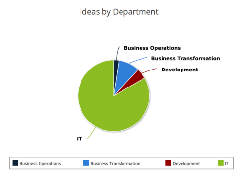 Ideas by Department report is a pie chart that displays count of ideas by department. Mouse over on the pie chart displays idea count for that department. You can further narrow your search by OBS Type & Path , Idea Status, Idea Start Date and Is Idea Active?.
 -
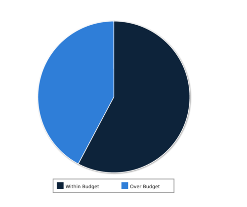 Project Cost within Budget report displays count of projects that are within or exceeding budget in the form of a pie chart. This report provides management a graphical representation of cost status on all projects. Mouse over on the pie chart displays count of projects for that category. You can further narrow your search by OBS Type & Path, Project Manager, Project Status, Project Stage, Program Name, Is project Active? And Is Template?.
 -
 RegoU Presentation from February 2014. Reports and portlets are an excellent way to communicate information to Clarity users, but you have to make sure they render information quickly. Rapid system response is one of the keys to end-user engagement and adoption. Queries are often created to optimize function over speed. This can affect overall system performance and hurt the user experience. In this session, you will learn some query tricks that Rego developers have used over the years to create high-performing reports and portlets. The video Presentation can be found on YouTube at this location: http://www.youtube.com/watch?v=66Zc44acDhQ&list=PLXJ5ktuWV0jj4TI078BQj4dJFlj1Gsee0&feature=share&index=22
 -
 ** No Download - Do not Add to Cart ** As the world’s largest advanced wastewater treatment plant operator, DC Water depends on a well-designed and comprehensive Project Management Office (PMO) to ensure that its 2.1 million customers have safe drinking water. In this webinar, you'll learn how DC Water joined with Rego to construct an award-winning, metrics-based PMO using Rego’s Clarity innovations. You’ll learn how their partnership resulted in a PMO that: - Drives effective Demand and Portfolio Management for IT projects and programs - Fosters real-time communication between Clarity and Microsoft 365 to keep DC Water’s Management team and Project Management community informed - Allows the IT PMO to measure progress on objectives through metrics ** No Download ** follow this link to sign up to view the recorded webinar - http://info.regoconsulting.com/how-dc-water-partnered-with-rego-march-2021
 -
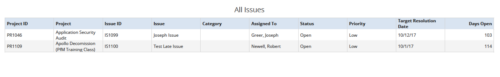 All Issues report provides the Project Managers a single place to view all the Issues across multiple projects. User can view only the projects that he has access to. This report provides Issue information such as ID, Name, Category, Assigned To, Status, Priority, Target Resolution Date and Days Open ( # of days Issue is open ) User can further narrow their search by OBS Type & Path, Issue Name, Project Name, Project ID, Is Project Active?, Issue Owner, Issue Status, Issue Target Resolution Date, Issue Category and Issue Priority.
 -
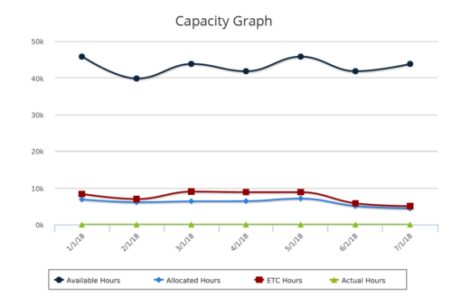 Capacity Graph report provides the Resource Managers & PMO a single place to view Monthly Availability, Allocations, Actuals and Assignments for one or more active resources. Information is displayed in the form of a line chart. Legend displays the color associated with each metric. Mouse over the line chart displays hours associated with that corresponding metric. This report provides Managers a simple means to analyze: Allocations vs. Availability, Allocations vs. Actuals, Allocations vs. ETC and ETC vs. Availability and helps in determining the areas of improvement. User can further narrow their search by OBS Type & Path, Month Start Date, Resource Name, Resource Manager, Primary Role & Employment Type.


Copyright 2023 • Rego Consulting Corporation • Privacy Policy