-
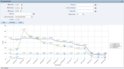
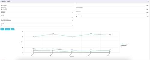 The Capacity Graph portlet displays Availability, Allocations, Actuals and Assignments for one or more active resource(s) in a single view. This portlet pulls data from timeslices, and allows the user to filter on a weekly, monthly or quarterly data. The Estimated Time to Complete (ETC) and Allocation data will only show for projects that are active. This portlet provides Resource Managers, PMOs and Executives with a simple way to analyse: Allocations vs. Availability, Allocations vs. Actuals, Allocations vs. ETC and ETC vs. Availability. The graph allows the user to determine where areas of improvement may exist and quickly identify potential areas of constraint. Note: the information displayed is dependent on what the user has security rights to view.
 -
 This training document is a Rego Consulting Quick Reference Guide to assist with creation of Roadmaps and the adding of investments to Roadmaps in Clarity’s Modern User Experience. This doc references version 16.1 views. Document provides detail on the Import from PPM function, Import from CSV as well as manual creation of Roadmap items. Detail is provided on how to create a manual Roadmap item from the Grid View, Timeline View or Board View. Instructions are also provided on how to synchronize a Roadmap.
 -
 This training document is a Rego Consulting Quick Reference Guide to assist with the saving and managing of Roadmap views in Clarity’s Modern User Experience. This doc references version 16.1 views. Document provides detail on the Save As feature for Roadmap views. Detail is provided on views created by others, how to manage existing views and how to save them as favorites. Timeline, Board and Grid view saving options are detailed.
 -
 This training document is a Rego Consulting Quick Reference Guide to assist with the updating, synchronizing and deleting of Roadmap investments in Clarity’s Modern User Experience. This doc references version 16.1 views. Detail is provided on how to update individual Roadmap items within the Grid View, Timeline View and Board View. Included are instructions on how to synchronize Roadmap investments and how to delete an investment from a Roadmap.
 -
 This training document is a Rego Consulting Quick Reference Guide to assist with the management of Roadmap items within the Grid View in Clarity’s Modern User Experience. This doc references version 16.1 views. Instructions are provided to help users add and remove columns, move columns, pin columns and sort rows of data. The document provides guidance on how to use the View Options function to manage Per-Period Metrics. Includes guidance on how to update Roadmap data from the Grid View and how to use the In Plan column to rank investments.
 -
 This training document is a Rego Consulting Quick Reference Guide to assist with the management of the Card View within Hierarchies in Clarity’s Modern User Experience. This doc references version 16.1 views. Document provides detail on View Options, Color By, Card Fields and Card Metrics. Information on how to roll up metrics via an aggregation or calculation method.
 -
 This training document is a Rego Consulting Quick Reference Guide to assist with the creation of Hierarchies in Clarity’s Modern User Experience. This doc references version 16.1 views. Document provides information on how to import investments and how to create child / parent relationships. Detail is provided with regard to the export of Hierarchies to PDF format.
 -
 This training document is a Rego Consulting Quick Reference Guide to assist with the management of the Grid View within Hierarchies in Clarity’s Modern User Experience. This doc references version 16.1 views. Document covers information on how to export to CSV, filter, create and save Views, use of the Column Panel and the Details panel.
 -
 Have you looked in the regoXchange or reviewed Rego’s innovation offerings? This class will show you the power of Rego’s pre-built content library, integrations, and other assets. See example after example of portlets, processes, and materials you can use to add value to your instance of Clarity. Learn how you can introduce email-based approvals with Rego's action item responder. Get a peek at Rego's new MSP integration that avoids the issues faced with the OOTB integration. Finally, understand Rego's pre-built connectors and how they can benefit your instance. Including blueprint migrator. Include free tools like GEL builder, query, XOGbridge.
 -
 A review of how Northern Trust integrates financial systems with Clarity PPM bilaterally, providing the Finance organization crucial information, and NT Project Managers with a birds-eye view of project financials. Utilizing the Rego Data Extractor and the Rego Data Processor, these information exchanges help Portfolio and Project Managers eliminate their manual and redundant efforts, solidify their overall data accuracy, and dramatically improve the content provided to their Execs for decision-making.
 -
 Part of our Business Transformation collection, this portlet relates exclusively to Benefit costs in the Portfolio and its investments. Portlet is a combination of Line Chart and Vertical Bar Charts. It displays data for one or more portfolios depending on rights and filters. Green Line represents Portfolio Target Benefits. Light blue bar represents aggregation of investment Planned Benefits. Dark blue bar represents aggregation of Investment Realized Benefits (actual benefits). Filtering is available for Above or Below Waterline investments OR all portfolio Investments. May also filter on Portfolio values as well as Plan values. Filtering also available for Active vs Inactive Portfolios.
 -
 Part of our Business Transformation collection, this portlet relates exclusively to Benefit costs in the Portfolio and its investments. Portlet is a combination of Line Chart and Vertical Bar Charts. It displays data for one or more portfolios depending on rights and filters. Green Line represents Portfolio Target Benefits. Light blue bar represents aggregation of investment Planned Benefits. Dark blue bar represents aggregation of Investment Realized Benefits (actual benefits). Filtering is available for Above or Below Waterline investments OR all portfolio Investments. May also filter on Portfolio values as well as Plan values. Filtering also available for Active vs Inactive Portfolios.
 -
 Part of our Business Transformation collection, this portlet relates exclusively to Benefit costs in the Portfolio and its investments. Portlet is a combination of Line Chart and Vertical Bar Charts. It displays data for one or more portfolios depending on rights and filters. Green Line represents Portfolio Target Benefits. Light blue bar represents aggregation of investment Planned Benefits. Dark blue bar represents aggregation of Investment Realized Benefits (actual benefits). Filtering is available for Above or Below Waterline investments OR all portfolio Investments. May also filter on Portfolio values as well as Plan values. Filtering also available for Active vs Inactive Portfolios.
 -
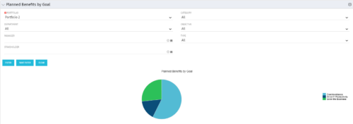 Part of the Business Transformation Package, this pie chart portlet shows planned benefits across the system grouped by Goal. The data is displayed form the investments in a portfolio. The portlet lets the Portfolio Manager know on which GOAL the planned benefit is allocated, so as to target the overall investment spread in the portfolio.
 -
 Part of the Business Transformation Package, this pie chart portlet shows planned benefits across the system grouped by Goal. The data is displayed form the investments in a portfolio. The portlet lets the Portfolio Manager know on which GOAL the planned benefit is allocated, so as to target the overall investment spread in the portfolio.


