-
 This training document is a Rego Consulting Quick Reference Guide to assist with the creation and management of Ideas in Clarity’s Modern User Experience. This doc references version 16.0.3 views. Doc covers creation of ideas, adding columns to the grid view and editing existing ideas.
 -
 This training document is a Rego Consulting Quick Reference Guide to assist with the creation of financial plans within Ideas in Clarity’s Modern User Experience. This doc references version 16.0.2 views. Document includes instructions on how to create cost plans, budget plans and benefit plans.
 -
 A Quick Reference Guide to assist in Staffing an Idea Team in Clarity. The document uses the Classic UX with the Phoenix theme.
 -
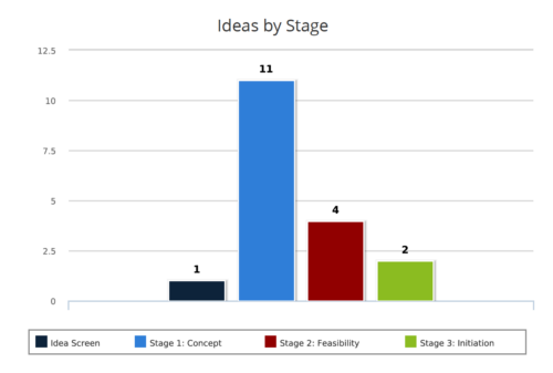 Ideas by Stage report is a column chart that displays ideas count by its Stage. Legend displays Stage names. Numerical value on the column bar indicates the idea count for that stage. You can further narrow your search by OBS Type & Path, Idea Status, Idea Start Date and Is Idea Active?
 -
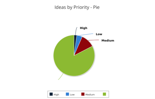 Ideas by Priority report is a pie chart that displays ideas count by priority. Mouse over on the pie chart displays idea count for that priority. You can further narrow your search by OBS Type, OBS Path, Idea Status, Idea Start Date and Is Idea Active?
 -
 Are you starting a demand management implementation? Do you want to compare how you are using these functions vs. how others are using them? In this class, we will discuss some best practices from successful customers.
 -
 Funnel Chart displays aggregated counts of Ideas by “Idea Progress”, a custom attribute. Chart shows Idea Progress names in legend, and count total is available as a mouse-over. No filters available on this portlet.
 -
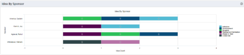 This portlet uses a bar graph to show the count of ideas by stage - grouped by the sponsor OBS. The X-axis displays the count and the Y-axis denotes the sponsor.
 -
This portlet uses a bar graph to show the count of ideas by stage - grouped by the sponsor OBS. The X-axis displays the count and the Y-axis denotes the sponsor.
-
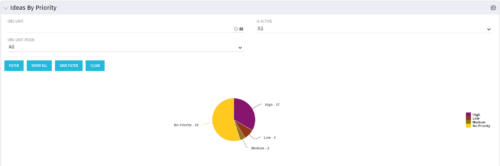 Pie Chart displays total Ideas by Priority, filterable by Active / Inactive and by OBS structure. Data Label and Mouse-over label display counts by Priority. Legend shows Priority Name. Chart also shows Ideas with No Priority.
 -
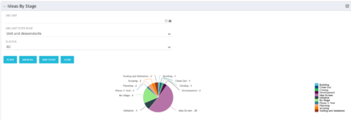 Pie Chart displays count of all Ideas by stage. Filterable by Active and Inactive, and also by OBS. Data label and mouse-over show Stage counts. Legend displays Stage names. This portlet assumes the use of the custom Stage attribute on Idea object.
 -
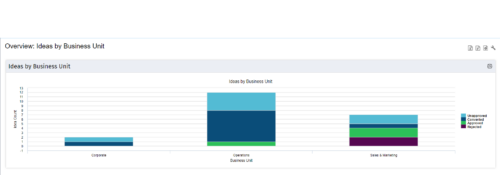 Part of the Business Transformation Content collection, this bar chart portlet displays count of ideas per business unit. This provides a holistic view of the idea pipe-line in an organization providing them a high-level of ideas converted, approved, unapproved per business unit.


Copyright 2023 • Rego Consulting Corporation • Privacy Policy