-
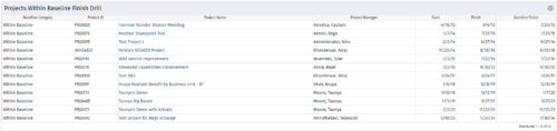
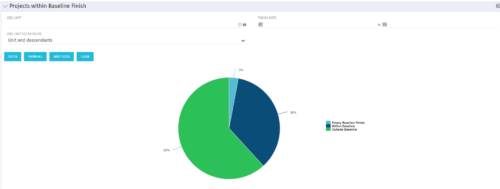 Pie Chart displays projects by Baseline Finish Variance—is current project finish beyond baseline finish; or is current project finish on or before baseline finish. Filterable by OBS structure and Finish Date range. Data labels show percent within baseline vs percent outside baseline. Mouse-over shows Within or Outside label and percent of total projects. Legend shows color coded Within Baseline and Outside Baseline labels. Drilldown: Clicking on a pie slice yields a grid portlet of projects either Within or Outside Baseline.
 -


The Percent Time by Type and Timescale - Grid portlet shows a breakout of time by timescale for resources the logged in user has view rights for using the timeslices. This portlet gives the Clarity user the ability to show the amount of hours spent on a project by week, month, quarter and year. Using this portlet, the Clarity user can get an overview of all hours in a time period or use the filter to search for a specific dataset (as required). The portlet provides a filter for OBS and date ranges. -
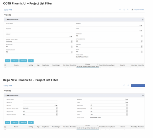
 Cleaner Phoenix UI Theme is very little padding and property sheet attributes are row based not column based.
 -
 Expand your training delivery options beyond MS Word and PowerPoint. Discuss the various training delivery mechanisms, and how to choose the right delivery method and combination of materials for the different types of courses you’ll deliver to your end users.
 -
 Tight budgets or disbursed teams often necessitate virtual training delivery. Discuss best practices and strategies to increase the effectiveness of your virtual courses.
 -
 A .pdf file that has the slide by slide presentation at 2015 RegoU on basic administration of CA PPM. The agenda covers an administration overview, objects, lookups, OBS/Security, portlets, processes, and support items.
 -
 A quick reference card to assist in the creation of a Financial Summary for an investment.
 -
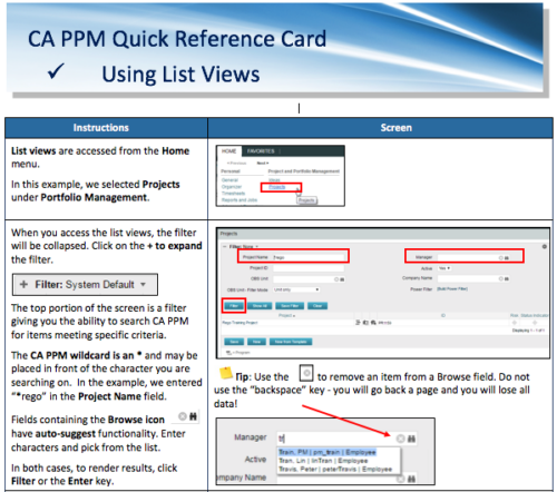 A Quick Reference Card to assist in the use of list views in CA PPM. List Views are accessed from the Home menu.
 -
 This video reviews the process of creating Timesheet Adjustments – making changes to a timesheet after it has been posted.
 -
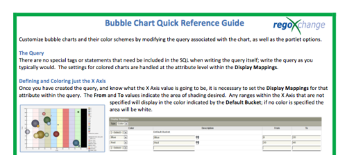 The Bubble Chart Quick Reference Guide provides the user instructions to customize bubble charts and their color schemes by modifying the query associated with the chart, as well as the portlet options. This is very beneficial as it allows the user to match or blend colors among all of the bubble portlets to better display the information the portlets are delivering. Similar data can be one color while different data can be its own color to better show the overall picture.


Copyright 2023 • Rego Consulting Corporation • Privacy Policy