
A presentation slide deck from Rego University 2022. This document reviews the best practices for resource management in Clarity.
|
-

-
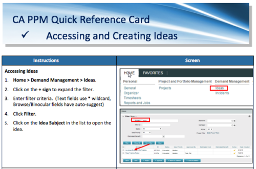 A Quick Reference Card to assist in the creation of Ideas in CA PPM. Ideas are created by going to Home, then Demand Management and choosing Ideas from the list menu.
 -
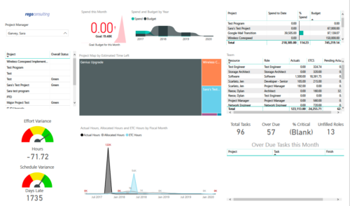 Project Health by PM is a dashboard that contains multiple visualizations showing various KPIs of projects managed by a project manager. Dashboard shows KPIs like summary of Over Due tasks, Critical tasks, Unfilled roles on Project, Effort and Schedule variance etc. Spend this month – Area graph that shows Actual vs Budget cost for current month. Spend and Budget by Year – Ribbon chart that shows yearly distribution of Actual vs Budget cost. Project Map by Estimated time left – Tree map representing ETC hours remaining on each project. Team – Grid section that shows list of team members with respective Actuals and ETC hours. Actual Hours, Allocated Hours and ETC Hours by Fiscal Month – Area graph that shows monthly distribution of Actuals vs Allocation vs ETC.
 -
 What should I expect to see within my organization related to PM over the next couple of years? How should I prepare my PMs, PMOs, or myself to embrace the new trends within the industry. This class will share Rego's observations on industry trends within PPM.
 -
 This training document is a Rego Consulting Quick Reference Guide to assist with use of the Common Grid. You can find the grid throughout the application to manage projects, tasks, roadmaps, ideas, and timesheets to name a few. The QRG reviews View Options, Column Adjustments, the Details Panel and more.
 -
 A Quick Reference Guide to assist in the use of Blueprints/Channels to access external sites, applications or Classic PPM in the Modern UX of Clarity. Reviews the configuraton process.
 -
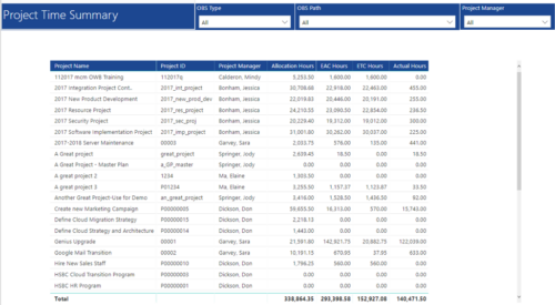 Project Time Summary report provides view of Allocation hours, EAC hours, ETC hours and Actual hours for Projects. User can further narrow their search by OBS Type & Path and Project Manager.
 -
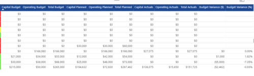
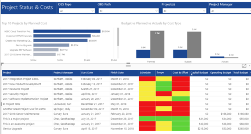 Project Status and Costs report has the details of the Project Schedule, Scope, Cost and Effort Statuses along with Planned, Budget & Actuals costs. There is also graphical representation that shows Top 10 projects by Planned Cost, Budget vs Planned vs Actuals by Cost Type. User can further narrow their search by OBS Type & Path, Project(s) and Project Manager.
 -
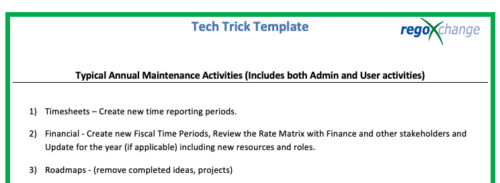 This is a list of 12 typical maintenance items that should be completed for Clarity on an annual basis. There is also a short list of items that should be completed periodically depending on client policies.
 -
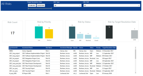 All Risks report provides project managers a single place to view KPIs related to Risks. All the KPIs are depicted in various visualizations. Risk Count: Scorecard that displays the # of Risks for the selected criteria. Risk Priority: Column chart that displays # of Risks by Priority. X axis displays various Risk Priorities. Data labels indicate the number of Risks associated with that category. Risk by Status: Column chart that displays # of Risks by Status. X axis displays various Risk statuses. Data labels indicate the number of Risks associated with that status. Risk by Target Resolution Date: Column chart that displays # of Risks by year of Target Resolution Date. X axis displays Year. Data labels indicate the number of Risks associated with that category. Grid: Displays Risk details such as Investment ID, Investment Name, Investment Manager, Risk ID, Risk Name, Owner, Status, Priority and Target Resolution Date. You can further narrow your search by OBS Type, OBS Path and Target Resolution Date range.
 -
 A presentation slide deck from Rego University 2021. This course covered enabling the Modern UX and timesheets, creating a link to the MUX in the classic home menu, creating Blueprints and more.
 -
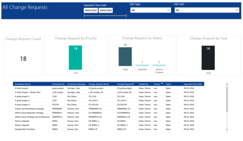 All Change Requests report provides project managers a single place to view KPIs related to Change Requests. All the KPIs are depicted in various visualizations. Change Request Count: Scorecard that displays the # of Change Requests for the selected criteria. Change Request by Priority: Column chart that displays # of Change Request by Priority. X axis displays various Change Request priority. Data labels indicate the number of Change Request associated with that category. Change Request Status: Column chart that displays # of Change Request by Status. X axis displays various Status. Data labels indicate the number of Change Request associated with that Status. Grid: Displays Change Request details such as Investment ID, Investment Name, Investment Manager, Change Request ID, Change Request Name, Status, Priority and Expected Close Date. You can further narrow your search by Expected Close Date Range, OBS Type and OBS Path.
