-
 This training document is a Rego Consulting Quick Reference Guide to assist with utilization of the Staffing page in Clarity’s Modern User Experience. This doc references version 16.1.2 views. Document provides detail on the layout and capabilities of the Staff Grid as well as the Allocations Timeline. Information is provided on columns, widgets and filtering. Instructions are provided on how to save Views. Summary information is provided on the layout of the Allocation Timeline and includes detail on the Investment Timeline and the Resource Histogram. Investment Timeline summary contains information on the Allocations by Investments and the Allocations by Resources tabs. While the Resource Histogram section provides screenshots on Resource Availability and Resources by Role.
 -
 This training document is a Rego Consulting Quick Reference Guide to assist with the creation and editing of Tasks in the Timeline View of Clarity’s Modern User Experience. This doc references version 16.2.1 views. Doc covers how to create a new task in the Timeline View, how to insert sibling or insert child tasks, how to set Milestones, access the Details pane and add resource Assignments. Also details how to move tasks by clicking and dragging within the Timeline View.
 -
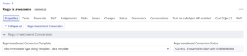
 Converts one Investment type to another investment type. Functionality • One investment type instance converted to another investment type • Investment object level attributes are copied over by default • Investment sub-objects can be chosen to be copied • The attributes and sub-objects to be copied to must be api enabled • Can convert from non api enabled object like other work to api enabled Custom CIT • Attribute mapping does not support multivalued lookups yet • If auto-numbering is not enabled for target investment type of the sub-objects, an ID will be auto-generated. • Associated risks and issues will not be copied over • Target investment status will be "Unapproved" • If there are Mandatory target investment type attributes either o use a template to convert where having a value in the attribute is not mandatory or Have a default value in the mandatory field defined on the object • If effort task creation is enabled, the effort task will also be brought over. o The effort task will appear with custom code if a investment template is used for conversion • The allocations will extend to the finish of the new investment if investment template is used which has tasks • Almost 500 instances of sub-objects are supported at this point. • The values in lookups need to be active or the process will error out • All required attributes must be api enabled
 -
 Are your project teams using SharePoint effectively and getting the most value out of it? Is document management a daily struggle? Learn how to use SharePoint with Clarity in a more seamless way to improve collaboration and team productivity.
 -
 Struggling to use an external scheduler like MS Project or Smartsheet with Clarity or investigating its potential? Learn how to effectively use these tools with Clarity in this training, which includes best practices and lessons learned. We will show both OOTB and Rego build connectors that will make the bidirectional connections seamless.
 -
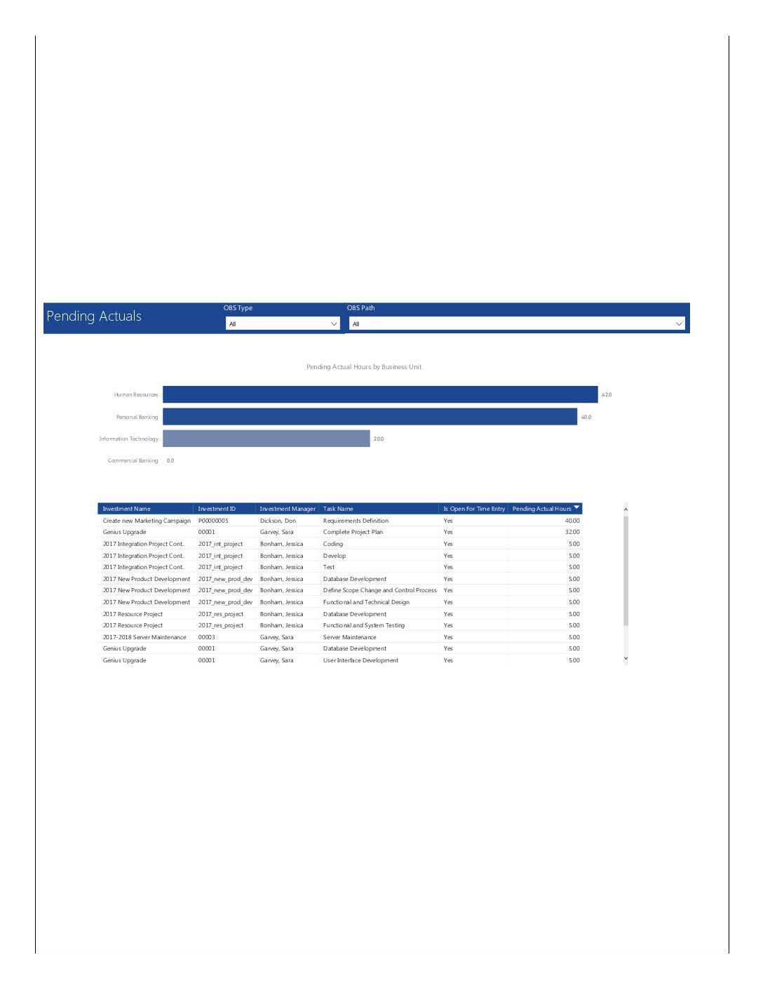 Pending Actuals report provides the Project Managers a single place to view all the pending actuals on tasks across multiple projects. This report provides graphical representation (bar chart) of pending actual hours by business unit. User can further drill down the details by clicking on particular business unit Managers can use this portlet to analyze the actuals that have been submitted but not posted on tasks. You can further narrow your search by OBS Type & Path.
 -
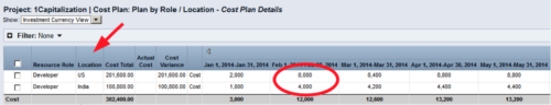 Many times Roles are spread out geographically or by function and these Roles will have different rates. For example, a developer in India may charge $25/hour vs a Developer in US may charge $50/hour. When the project team has a requirement of several developers, the PM will have to add a region specific role (Developer-US, Developer-India) so that the right rates can be applied when a cost plan is created. This creates a challenge in terms of Resource Management. As the Demand and Capacity can be spread between different region specific roles. Proper configuration on the Rate Matrix can allow you to have one Role name but different rates based on Location or Department. This allows greater flexibility and takes away the redundancy of Role Names. You can do so with the Project Team Member Properties.
 -
 A Quick Reference Guide to assist in the creation and management of Status Reports in Clarity’s Modern UX. Reviews accessing the project details from the grid or tile view, creation of a new status report, existing status reports in Classic, updating status reports, customizing project status, and the project status list view.
 -
 A Quick Reference Guide to assist in creating and editing Project Baselines in Clarity Classic with the Phoenix theme.
 -
 You are no longer regulated to the desktop browser to respond to action items. Learn how Rego solved this problem using just your email. We’ll talk about various use cases where you would get maximum benefit from a simple response on an action item directly from your email. It doesn’t matter if you are using email on your desktop, laptop, phone or tablet. The Action Item Responder as you covered.
 -
 Struggling to use an external scheduler like MS Project or Smartsheet with Clarity or investigating its potential? Learn how to effectively use these tools with Clarity in this training, which includes best practices and lessons learned. We will show both OOTB and Rego build connectors that will make the bidirectional connections seamless.
 -
 A Quick Reference guide to assist in the creation and management of project cost and budget plans in Clarity’s Modern UX. Reviews the access of project details from the Project Grid or Tile views, creation of a cost and budget plan, and edits to those plans.


Copyright 2023 • Rego Consulting Corporation • Privacy Policy